Why Mobile-First Web Design is No Longer Optional in 2025
Mobile-First Web Design: The New Standard in 2025
Mobile-first web design is no longer just a trend; it has become a business requirement in 2025. With the majority of internet users browsing and shopping from smartphones, businesses that do not prioritize mobile optimization risk losing both traffic and customers. For small business websites and established brands alike, ensuring that a site is designed with mobile users in mind is now directly tied to online success.
In this post, we’ll explore why mobile-first web design is critical, what it means for your business, and how the right web development approach can maximize your website investment.
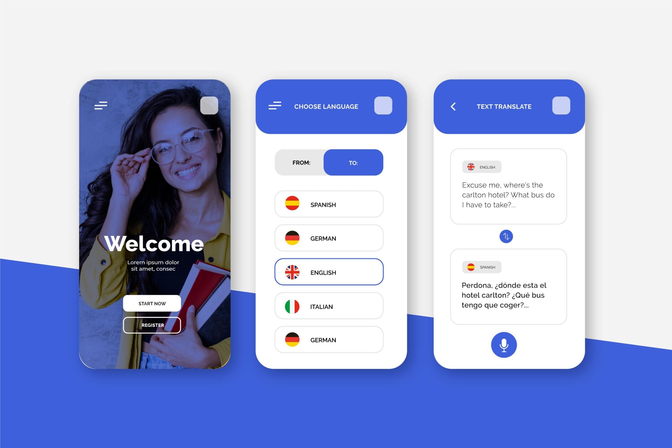
Mobile-first design begins by building a website for smaller screens before scaling it up for desktops. Instead of squeezing a desktop site onto a phone screen, designers create layouts, navigation, and content that work seamlessly for mobile users.
This approach ensures:
By focusing on the mobile experience first, businesses guarantee that their websites perform well where it matters most.
1. Google’s Mobile-First Indexing
Since Google now prioritizes the mobile version of websites for ranking, having a site that isn’t mobile-optimized means lower visibility in search results. For small business websites that rely on local SEO or eCommerce, this can significantly impact customer acquisition.
2. User Experience is a Trust Signal
A responsive website communicates professionalism. When users encounter clunky navigation, slow load times, or distorted layouts, they lose trust in the brand. On the other hand, a smooth mobile experience signals reliability and credibility.
3. Mobile Traffic Dominates the Web
As of 2025, over 60% of global internet traffic comes from mobile devices. This number continues to grow. Businesses that neglect mobile-first web design essentially ignore the majority of their potential audience.
4. Conversions Happen on Mobile
From online shopping to booking services, customers are increasingly completing transactions from their phones. A poor mobile design means abandoned carts, missed inquiries, and lost sales.
The Business Impact of Mobile-First Web Design
Investing in mobile-first design has direct benefits for business growth:
This is especially true for industries like retail, hospitality, and professional services, where first impressions online directly influence purchase decisions.
For small businesses, a mobile-first approach is not just about keeping up with big brands. It’s about building a strong online presence that attracts and retains local customers. Imagine a potential client searching for your services while on the go. If your site is easy to use on their phone, you have already earned an advantage over competitors with clunky, desktop-focused designs.
Key Elements of Mobile-First Design
A mobile-first strategy goes beyond simply “making the site smaller.” Some important elements include:
These web development benefits improve not just usability, but also brand perception and overall customer satisfaction.
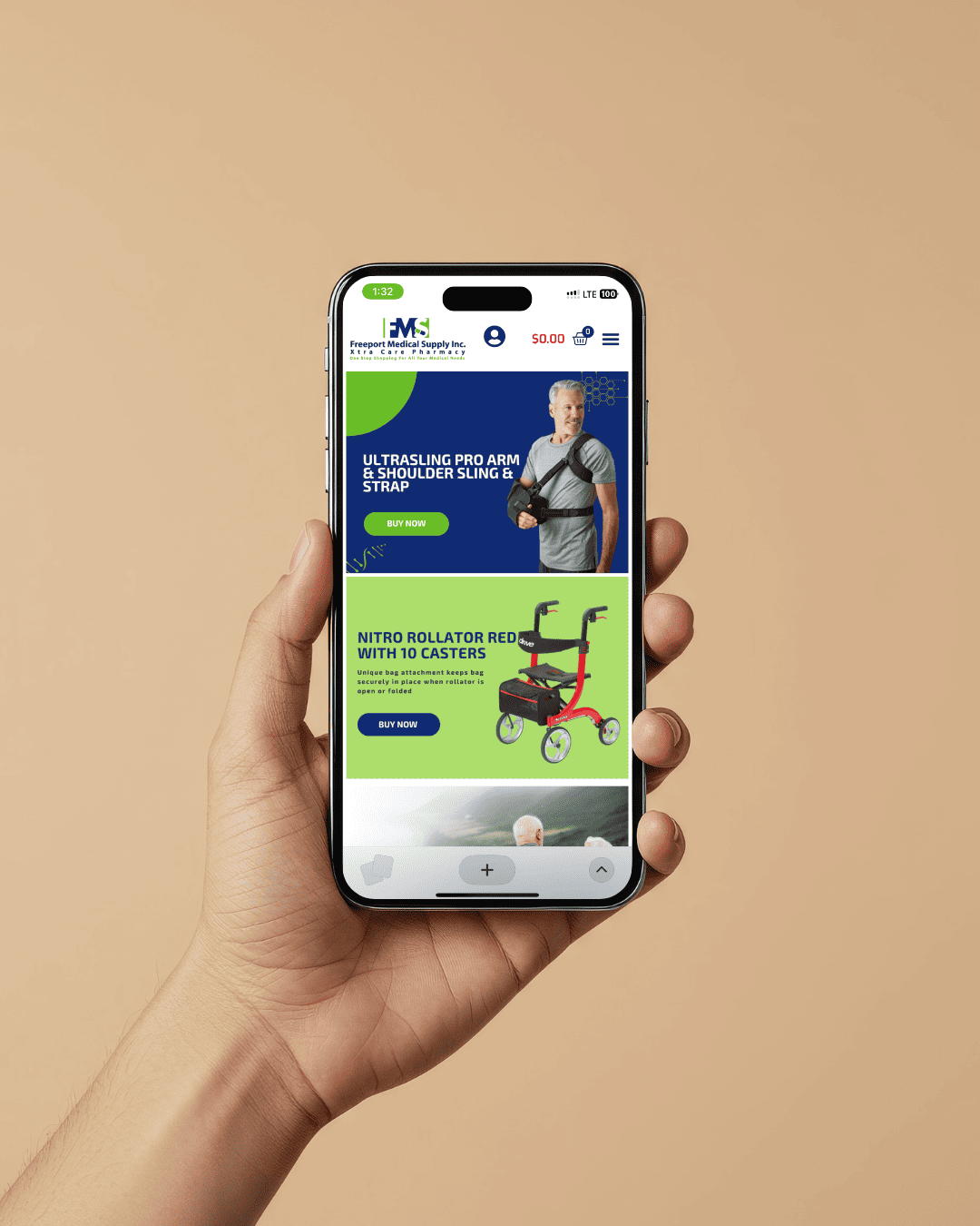
Why Cheap Templates Fall Short
Template websites often claim to be “mobile-friendly,” but they rarely provide a true mobile-first experience. Many templates are desktop-centric, only adjusted later for mobile. This results in slower loading times, poor navigation, and reduced SEO performance.
While template websites may seem cost-effective at first, they often result in higher long-term expenses, including lost leads, redesigns, and missed branding opportunities. A custom-built, mobile-first website is an investment that continues to generate returns over time.
Branding Impact of Mobile-First Design
Your website is often the first point of contact with potential clients. A mobile-first design shows that your business values accessibility, professionalism, and user experience. This creates a positive branding impact, setting you apart in competitive industries.
A professional, mobile-optimized site builds trust by delivering consistency across devices, whether your client is visiting from a smartphone, tablet, or desktop.